
Eternity’s Visual Identity: The Power of Circular Design
Eternity’s Visual Identity: The Power of Circular Design
The starting point for Eternity’s visual identity began with a perfect circular shape. The rest of the visual language just came into the orbit of it, (no pun intended), from the circular shape of most interactables, the choice of typeface, and even the circular progress bars.

UI design from a simple circle
This graphic choice also came as a need to offer the game a chance to have its own identity, from the logo to the interface.
We wanted to make sure that, by seeing a single screen capture, animation, or icon throughout the game, you can easily identify that familiar golden circular shape.
Another aspect we wanted to reinforce with the circular language was to challenge the typical “everything in its own slot” approach to the menus and interactables you see in most games of the same genre.
Eternity takes place in an advanced, futuristic age where technological advancements completely reshaped how we interact with the world.
In this reality, interacting with the world is done, not by physical rectangular screens or blocky buttons stuck in crowded control panels, but with interactable projections and circular screens, unconfined from the limitations of the physical space, allowing for new ways of interaction.
It would only make sense to bring this concept to the player, offering him the same level of freedom that they would experience aboard one of the ships in the fleet.
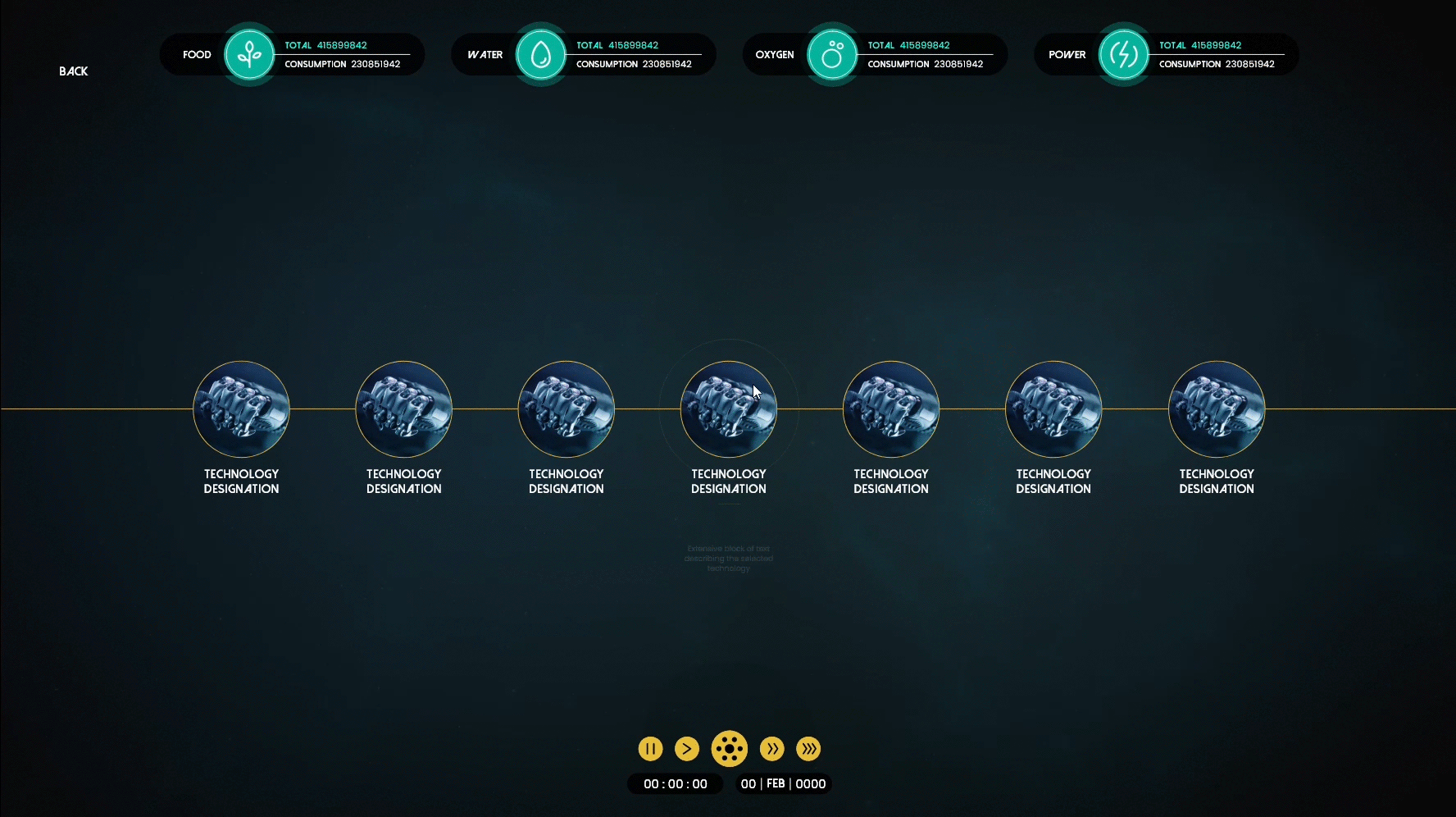
Technology skill tree menu (concept)
THE GAME LOGO
Following the overall circular rule, Eternity’s logo is no exception, however, the logo itself takes a lot more from its circular structure than just interactables.
The logo carries the key aspects of the player’s purpose. These key aspects include:
- The solar systems to which the players carry their fleet, exploring its resources, dealing with its dangers and obstacles, and then moving on to the next one.
- The astrolabe, an essential tool used long ago during the age of discovery, granted past explorers an understanding of their route through perilous vast blue oceans.
- The denomination of the player’s sole purpose is at the very center. This element is marked in white, similar to the ships roaming around in their tracks, representing the direction association of the player’s fleet and its main goal.
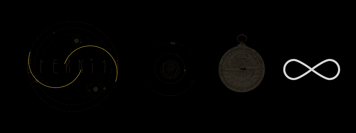
Logo’s references
GOLD OVER DARK
Considering the overwhelming darkness that composes the game environment, it only made sense for contrast, to choose a much lighter color for various interactables and menu layouts throughout the game. Though the initial color was white, the contrast was not only boring and basic but also created too harsh of a contrast for something that will be constantly on screen. The golden yellow offers a smother, yet effective contrast against the dark environment.
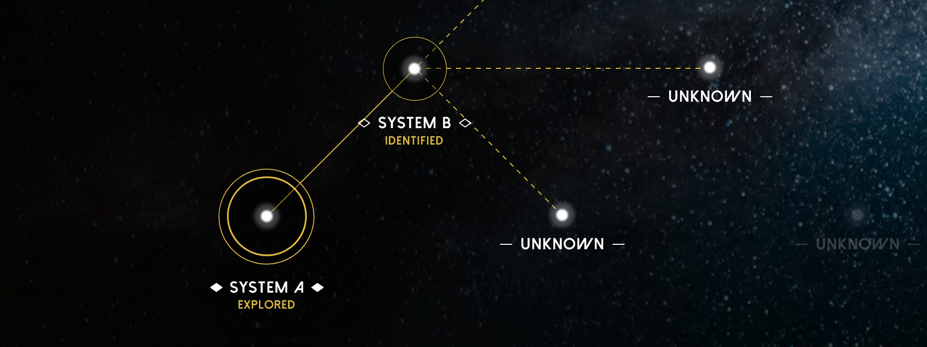
Starmap menu (concept
The choice of this color carries another significance aside from its technical aspect. The gold is also representative of the “golden path”, “El Dorado”, the “yellow brick road”…
These concepts have always been associated with a goal, an objective, or an ambition on behalf of someone walking a path towards something they desire without knowing exactly what awaits along the way.
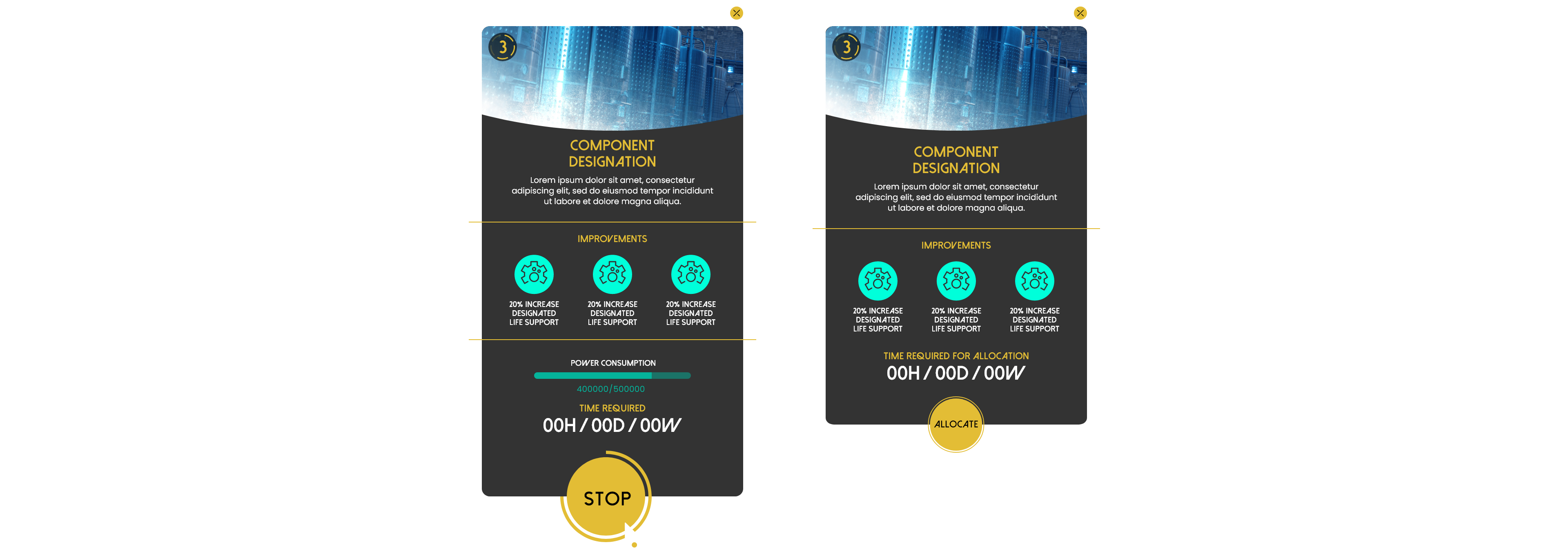
Technology inspector during progress interruption (concept)
BACK TO BASICS
One of the requirements for Eternity’s visual language, and as an extension of its user interface, was the use of simple geometric shapes for the base elements and simple line art for the graphic elements. Considering the amount of information present on-screen throughout most of the game’s playtime, we had to consider what was more important.
In most games of this genre, super detailed graphic elements can sometimes overstretch their purpose and visually compete with the information it’s supposed to complement and enhance.
In the case of Eternity, taking into consideration the ever-present game environment in the background, we needed to keep the screen clear of any unnecessary decorative frames and permanent visual effects that could compromise, not only the relevant info on screen but also diffuse the same info with the ongoing game environment in the background.
Another aspect we had to take into account was the vast types of interactions presented to the player on screen. Though the language might come across as overly simplified, it allows for the various graphic elements and layouts to stay dynamic and mutable, allowing to alter shape to adapt to a player’s decision or a game event.
From the logo to the interface, Eternity’s visual identity is built on a foundation of simplicity, cohesion, and purpose.
The circular design is more than just an aesthetic choice, it reflects the game’s themes of exploration, navigation, and the unbounded possibilities of the cosmos. Every element, from interactables to menus, reinforces this vision, ensuring that players are fully immersed in the futuristic world we’ve crafted.
As we continue refining Eternity’s design language, we’re excited to share more insights into our creative process. Stay tuned for future updates.
Until next time, spacefarers, keep your course steady and your ambitions unbound.